
Feature Wall Colours That Actually Work (And a Few That Don't)
Key takeaways
- Pick the wall that already draws the eye, not just any wall.
- Proper preparation matters as much as the colour itself.
- Deep tones need more coats; budget accordingly.
- Period proportions suit richer, more saturated colours.
- A feature wall only works if the rest of the room is settled.
Picking the right wall and the right colour
Choose the wall first, then the colour. The feature wall should be one the eye naturally lands on when you walk in, usually the wall a bed or sofa sits against. Pick the colour to work with your existing light levels and floor tone, not against them.
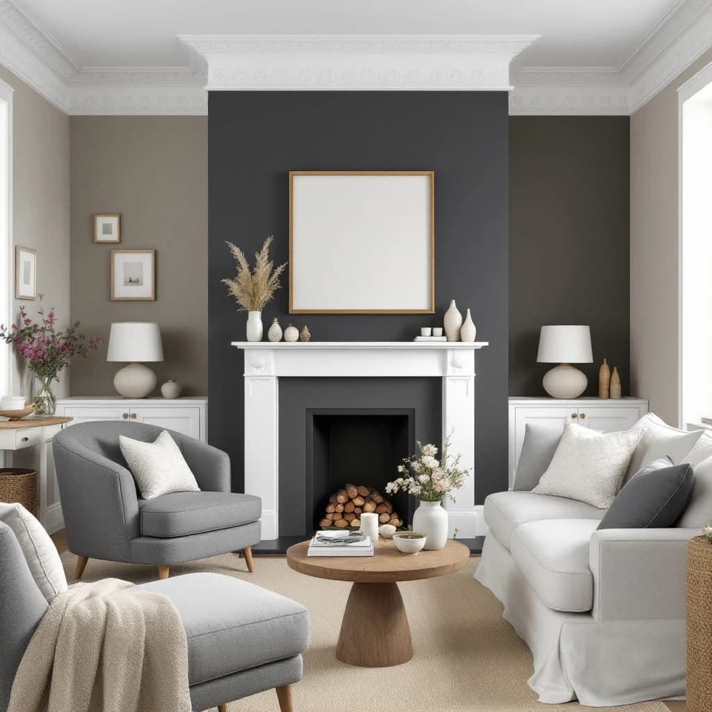
In most rooms there is one obvious candidate: the chimney breast, the alcove wall, or the wall facing the door. If you have to hunt for it, a feature wall probably will not read well in that room.
Once the wall is chosen, think about how much natural light the room gets. A north-facing room with limited daylight can handle a deep colour, but it will absorb light rather than bounce it. A south-facing room gives you more latitude.
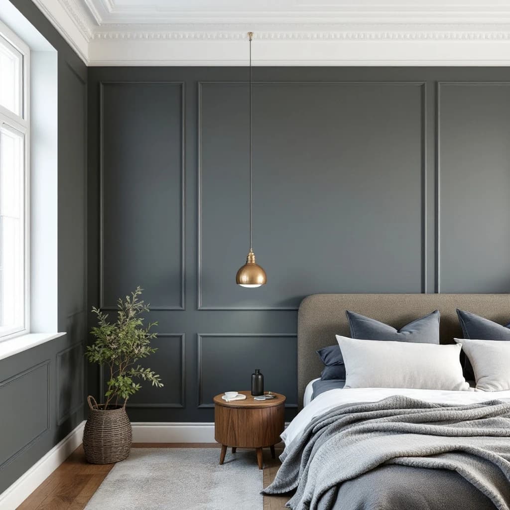
For period properties in particular, richer and more saturated tones tend to suit the proportions better than washed-out pastels. Colours with a clear identity, a proper navy, a warm terracotta, a deep sage, tend to hold their own against high ceilings and original cornicing.
If you are weighing up whether a feature wall is the right move at all, my earlier post on whether accent walls are actually worth painting covers the fundamentals in more detail.
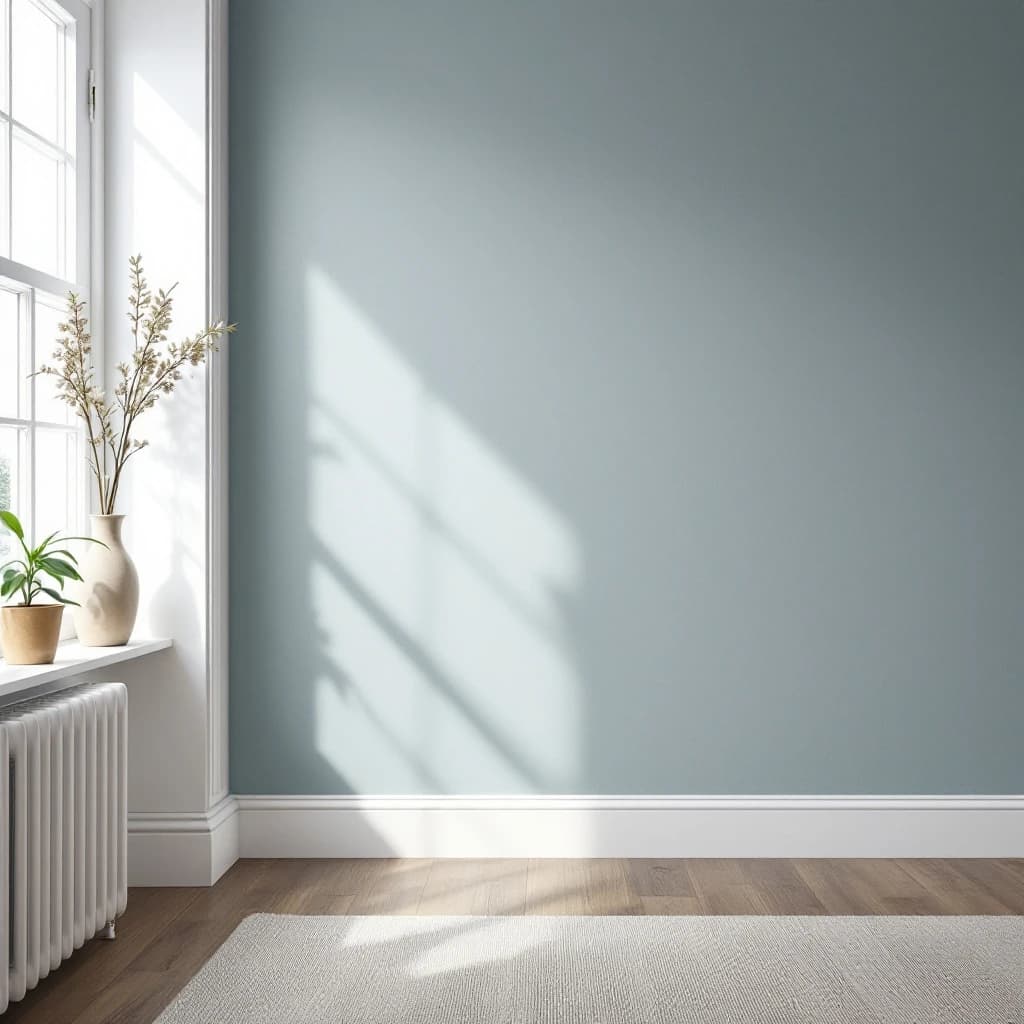
Proper preparation is what stops a deep colour from looking patchy six months later.
Bedroom feature walls: what tends to work in older Brighton & Hove stock
Victorian and Edwardian terraces in BN1, BN2, and BN3 tend to have bedrooms with reasonable ceiling heights and at least one bay or chimney breast. Both give you a natural focal point.
The wall behind the bed head is the most common choice. Deep dusty blues, warm charcoals, and earthy greens all read well here, especially alongside white or off-white woodwork on skirting and architraves.
Avoid colours that fight with the floor. If you have original floorboards with warm amber tones, a cool grey-blue can look disconnected. A deeper green or a warm dark neutral will sit more comfortably. Test a large sample panel and live with it for a couple of days before committing.
Prep and finish matter more than the colour choice
The colour is the easy part. What makes a feature wall look right for years is the preparation underneath it. Filling, sanding, priming, and applying the correct number of coats is what stops a deep colour from looking patchy or uneven six months later.
Deep tones are unforgiving. Any imperfection in the plaster, any missed hairline crack or uneven patch, will show through once the colour is on. I always spend more time on a feature wall than on the surrounding walls precisely because there is nowhere to hide.
Finish choice matters too. A flat or dead-flat matte is a strong choice for period properties; it absorbs light in a way that suits older walls and hides minor surface variation better than a mid-sheen. If the wall gets touched regularly, a soft-sheen gives a wipe-clean surface without looking plasticky.
Deep colours from quality ranges, whether Crown or Dulux, often need three coats over a good primer to reach full depth. Cutting that down to two coats to save time is a corner not worth cutting; the colour will look thin and the finish will suffer.
When a feature wall is worth it and when to rethink
A feature wall earns its place when the room already has a clear focal point and settled surrounding colours. It is worth reconsidering if the rest of the room is unresolved, the wall is awkwardly shaped, or you are trying to use colour to distract from a structural problem.
The most common mistake is choosing the feature wall before deciding what the room is doing overall. If the surrounding three walls are still unpainted or in a colour that does not work, adding a dark accent wall will not fix things; it will highlight the problem.
Irregular walls are another issue. Older Brighton and Hove properties sometimes have walls that bow or have been patched unevenly over decades. A deep, flat colour on a bowed surface will catch the light at every angle and make the imperfections more obvious, not less.
If you are unsure, keep it simple: paint the whole room in one considered colour first. You can always add a feature wall later. If you would like a second opinion before committing to paint, send me a few details and I will take a look.
Frequently asked questions
Which wall should be the feature wall in a bedroom?
Usually the wall the bed sits against, as it is the first thing you see when you walk in. In a room with a chimney breast, that is often the obvious choice. Avoid walls with multiple windows or doors breaking them up, as the colour has nowhere to read as a continuous surface.
What colours work best for a feature wall in a period or Victorian property?
Richer, more saturated tones tend to suit the proportions of Victorian and Edwardian rooms. Deep blues, warm charcoals, earthy greens, and dark terracottas all work well. Thin, washed-out pastels can look lost against high ceilings and original period details. Always test a large sample panel in the actual room light before committing.
Do feature walls need a different paint finish to the rest of the room?
Not necessarily, but it is worth thinking about. A flat or dead-flat matte is a reliable option for period walls as it handles minor surface variation well. If the wall gets regular contact, a soft-sheen gives a more practical surface. The key is using a quality paint with good pigment depth; deep colours in particular need proper coverage to look right.
More reading
Related service
Want this doing in your own place? See my interior painting & decorating service across Brighton & Hove.