
Designer Walls Without the Designer Price Tag
Key takeaways
- Designer wall paint means better pigment and coverage, not just a premium label.
- Preparation matters more than which tin you buy.
- Flat matt finishes read as polished and hide minor surface imperfections well.
- Coastal light in Brighton & Hove shifts colour; always test a sample on the actual wall.
- Deep or dark colours can work in smaller rooms if the prep and finish are right.
What 'designer wall paint' actually means in practice
Designer wall paint usually means higher pigment load, better coverage per coat, and a finish that stays true as it dries. You're paying for the formulation, not the brand story. A trade-quality paint applied well will often outperform a boutique tin applied poorly.
The word 'designer' on a tin mostly signals a deeper colour range and a more refined flat finish. Brands like Farrow & Ball, Little Greene, and Mylands have built their reputations on pigment density and a matt that reads as genuinely flat rather than slightly chalky.
That said, Dulux and Crown both offer heritage and deep-tone ranges that sit close in quality. Working across Brighton & Hove, I've used both premium and trade ranges on period properties, and the result is rarely about the tin alone.
What actually separates a wall that looks considered from one that looks flat in the wrong way is how it was prepared, how many coats went on, and whether the finish suits the light in the room.
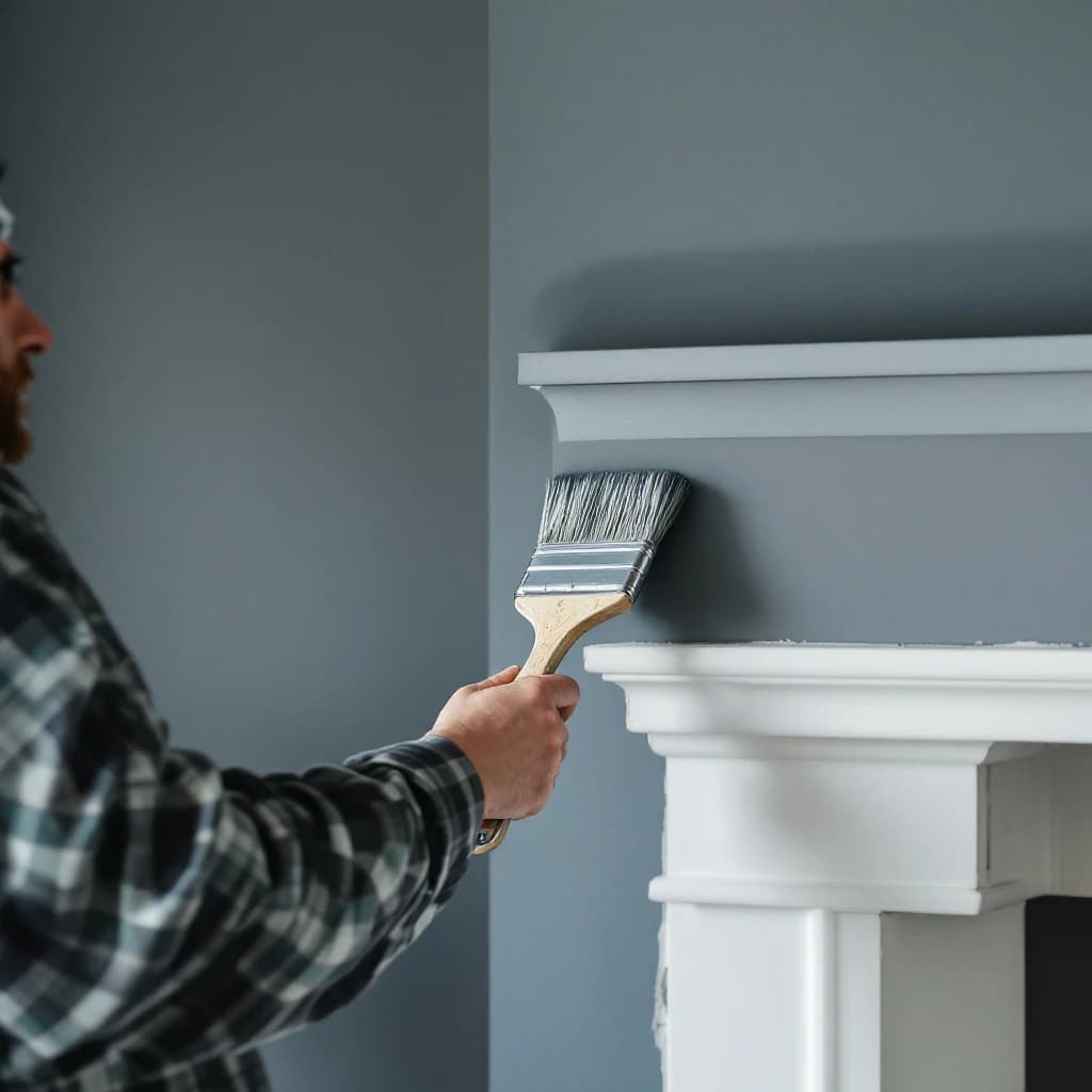
Proper preparation is what separates a wall that looks good on day one from one that holds up for years.
Colour, finish, and preparation: the three things that do the real work
Colour sets the mood, finish determines how the surface reads in different light, and preparation decides how long it all lasts. Get one of those three wrong and the result will show, regardless of how much you spent on the paint. All three working together is what produces walls worth noticing.
Finish is often overlooked. For interior walls where you want a polished, considered look, flat matt is usually a strong choice; it absorbs light rather than bouncing it, which makes even strong colours feel deliberate rather than harsh.
Eggshell and soft sheen have their place on woodwork and in higher-traffic rooms, but on a feature wall in a living room or bedroom, a quality flat matt tends to do the most work visually.
For the full scope of interior painting and decorating I carry out across BN1, BN2, and BN3, finish selection is always part of the conversation before a brush goes near the wall.
Why preparation matters more than the paint brand
Proper preparation is what separates a wall that looks good on day one from one that holds up for years. Filling, sanding, priming, and cutting in cleanly are the unglamorous parts that make the finished surface worth looking at.
On older Brighton & Hove properties especially, walls often have hairline cracks, patchy plaster, or areas where previous coats have been applied over bare surfaces. Skipping the prep and going straight to a deep or heritage tone will show every flaw more clearly, not less. Preparation like this is the bulk of any interior decorating job I do in Brighton.
Corners not cut at this stage is what allows a strong colour to read as intentional rather than just dark.
Picking a palette that suits a Brighton & Hove home
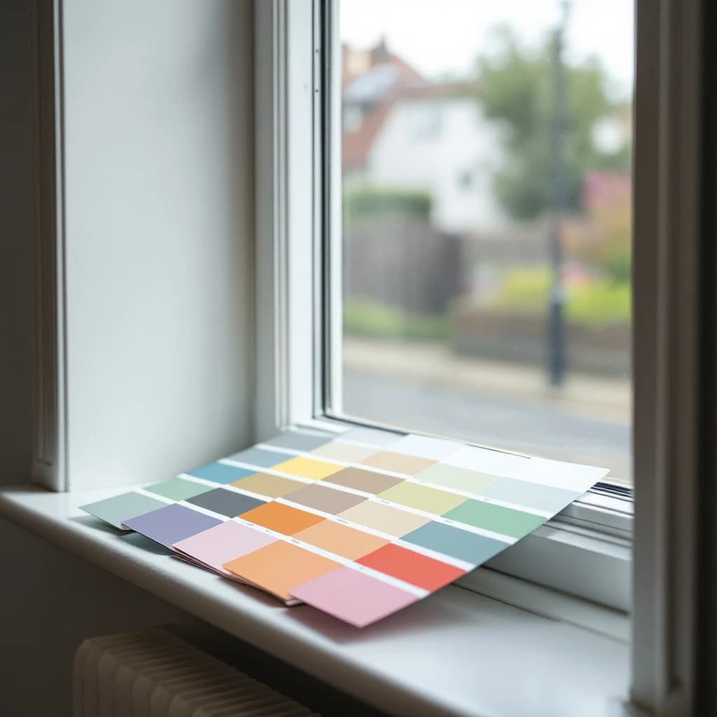
Coastal light in Brighton & Hove is bright but shifts throughout the day, which means a colour that reads as warm in a showroom can look quite different on your wall by afternoon. Testing a sample in the actual room, in natural and artificial light, is always worth the extra day or two.
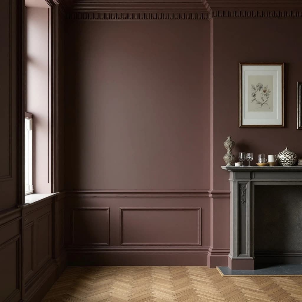
Period properties in Hove and Brighton tend to have high ceilings, deep coving, and generous skirting. These architectural details work well with saturated heritage tones; deeper greens, warm off-whites, and chalky blues tend to suit the proportions without fighting the original features.
Smaller rooms are not off-limits for dark or deep colours. A well-prepared surface with a proper flat matt finish and crisp woodwork in a contrasting tone can make a compact room feel deliberate rather than heavy.
If you're weighing up options for a repaint, arrange a free quote and I'm happy to talk through what tends to work well for the kind of property and room you have in mind.
Frequently asked questions
Is designer wall paint worth the extra cost over standard trade paint?
It depends on what you mean by designer. Premium heritage ranges do offer richer pigment and a flatter finish that's hard to match exactly. But a good quality trade paint, properly applied with the right number of coats and solid preparation underneath, will often get very close. The preparation and application matter as much as the tin. If you're browsing ideas, the Hove Decor blog covers more on choosing materials and finishes for period properties.
What paint finish gives the most polished, high-end look on interior walls?
Flat matt is generally the finish that reads as most polished on interior walls. It absorbs light evenly, which makes strong or deep colours look considered rather than overpowering. The trade-off is that flat matt marks more easily than an eggshell or soft sheen, so it works best in rooms that don't take heavy day-to-day wear.
Can I use deep or dark wall colours in a smaller Brighton & Hove room without it feeling cramped?
Yes, with the right approach. Proper preparation of the surface is essential; any unevenness will be more visible under a deep tone. A quality flat matt finish and crisp, lighter woodwork help a lot. In Brighton & Hove's period flats and terraces, rooms with good ceiling height often carry deep colours well, even when the floor area is modest.
More reading
Related service
Want this doing in your own place? See my interior painting & decorating service across Brighton & Hove.